Élan Noir
Beauty / Fragrance
Home Fragrance
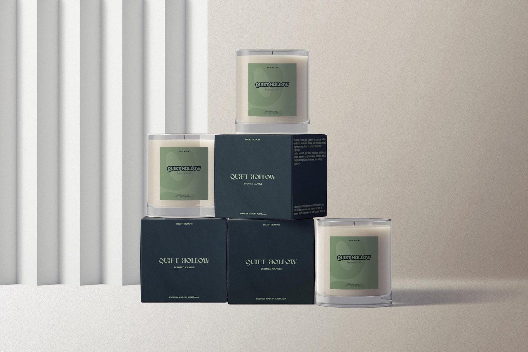
The candle market is saturated with brands that signal premium through the same visual language: cream and sage palettes, lowercase serif logotypes, botanical illustrations, kraft paper.
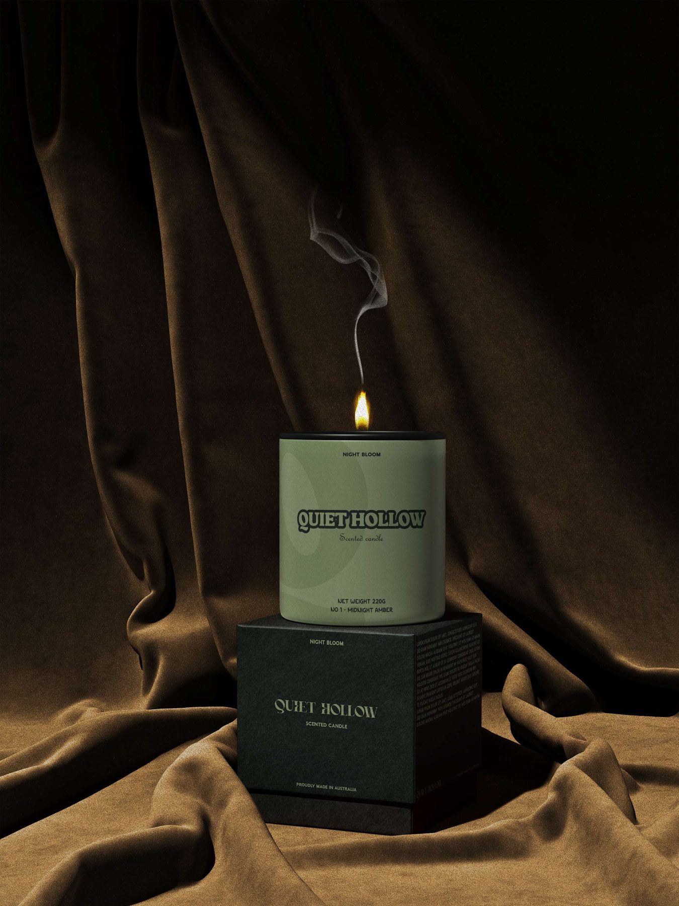
Quiet Hollow needed new signals — a visual language that feels considered and elevated without borrowing the category's worn vocabulary.
Project year — 2026
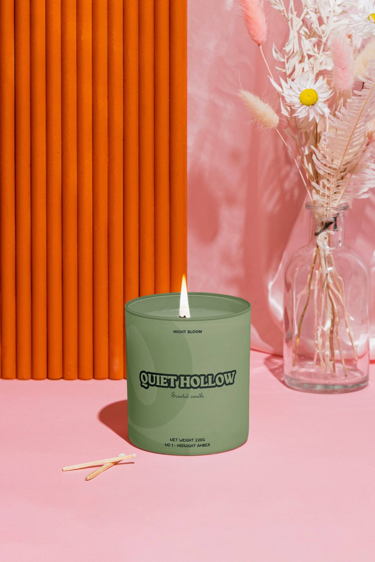
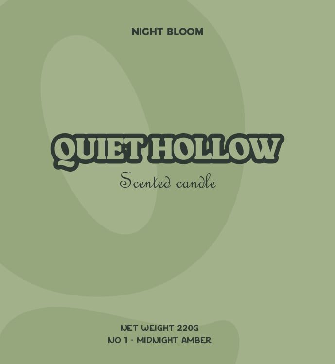
The packaging was built around negative space and typographic restraint. Product name, scent notes, and volume are rendered in a precise typographic hierarchy with nothing added that doesn't earn its place.
A restrained system of sophisticated neutrals carries one differentiated accent per variant, with uncoated soft-touch label stock and a debossed logotype specified from the start.
“Packaging for a brand you'd keep on your shelf long after the candle is gone.”
Featured projects