Quiet Hollow
Home Fragrance
Food & Beverage
The hot sauce shelf is loud. Every brand is competing on heat claims, mascot aggression, and novelty typography that shouts before it communicates.
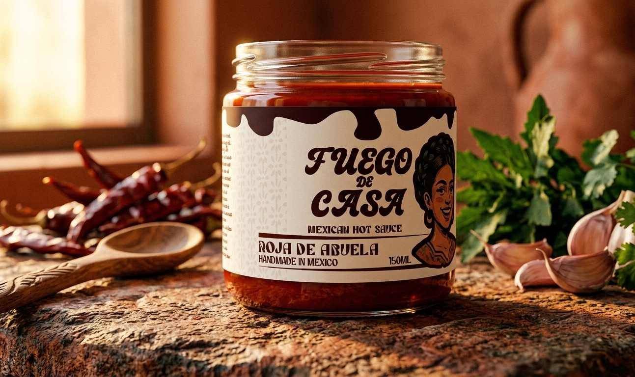
The brand needed to feel rooted — in craft, in culture, in the kind of kitchen where this sauce actually lives — without defaulting to the visual clichés that flatten Mexican food brands into costume.
Project year — 2026
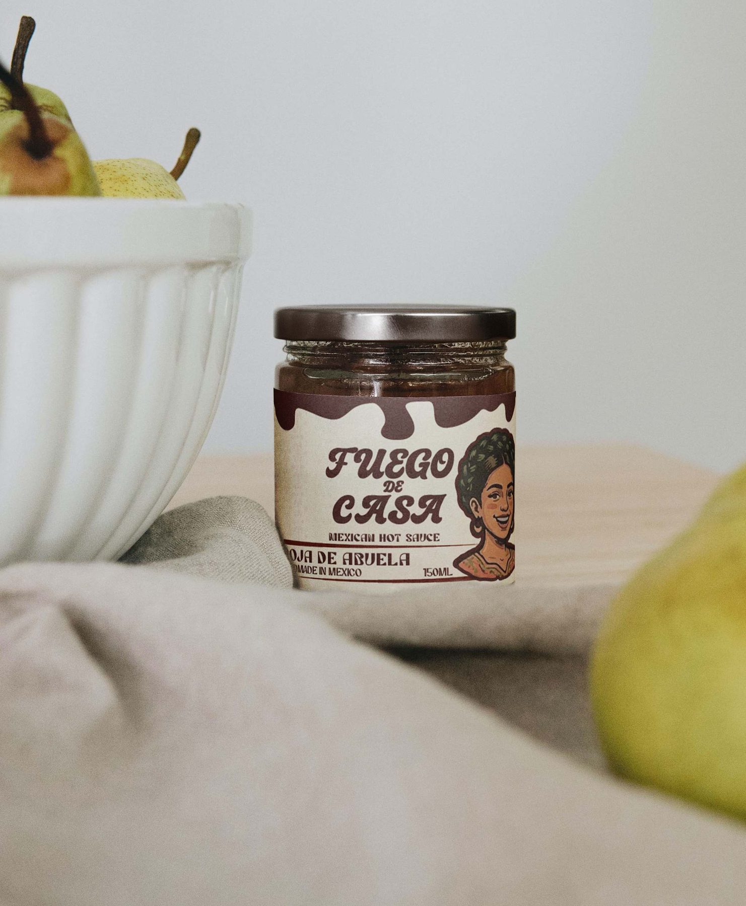
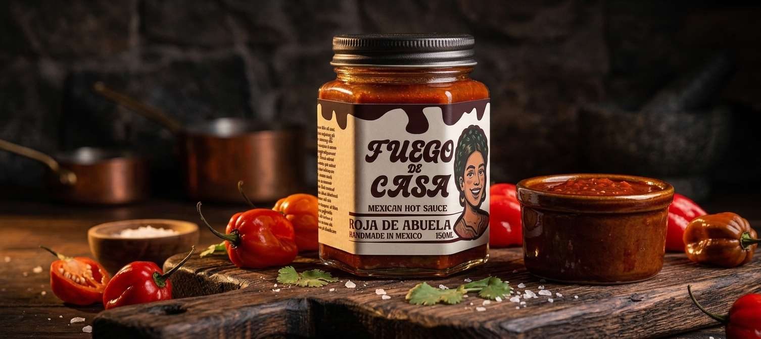
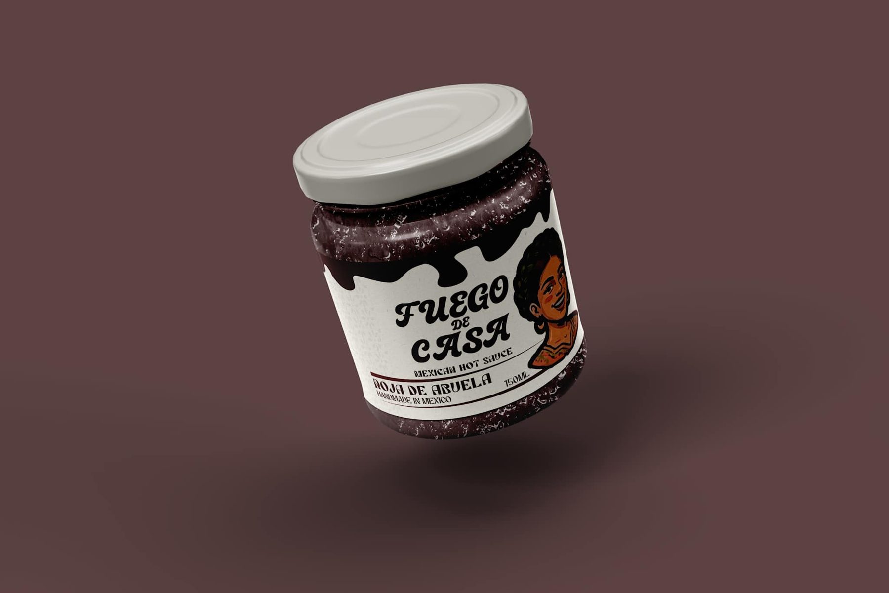
The design system was built around hand-drawn type as the primary visual element — the kind of type that looks like someone made it, not like someone chose it from a font menu.
Character illustrations add personality without competing with the typography, and each of the three SKUs is color-coded so the line reads as a family on shelf and as individual products in hand.
“The most confident brand in the category doesn't need to raise its voice. It just needs to be unmistakably itself.”
Featured projects